Although I don’t use a credit card often, I did have a balance to settle recently. While in the Chase Online account management controls, I had a need to view some activity history. While using it, I noticed a couple of usability points which I thought I would outline here as a user experience exercise.
The Good
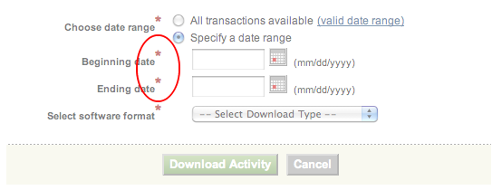
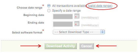
Note that when a user selects the “Specify a date range” radio button, the “Beginning date” and “Ending date” fields are not only enabled for keyboard entry, but the red asterisk indicator is added to those field labels to remind us that these fields are now required to submit the search. Naturally, when the “All transactions available” radio button is selected instead, those red asterisks are removed because the range fields no longer apply to the user’s search.

The Bad
On the other hand, I found the “valid date range” link’s location to be counter-intuitive. Shouldn’t it sit next to the “Specify a date range” text? After all, a valid date range doesn’t apply in any case where all transactions are searched. Additionally, a fundamental ux standard is being snubbed here with the placement of the cancel button to the right and the default-emphasised action (submit) button on the left. If the default action were something destructive as in a “Delete”, one might find this almost forgivable. However, this is not the case with searching.

Categories:User Experience
Comments: No comments yet
Comments not allowed for this post.